
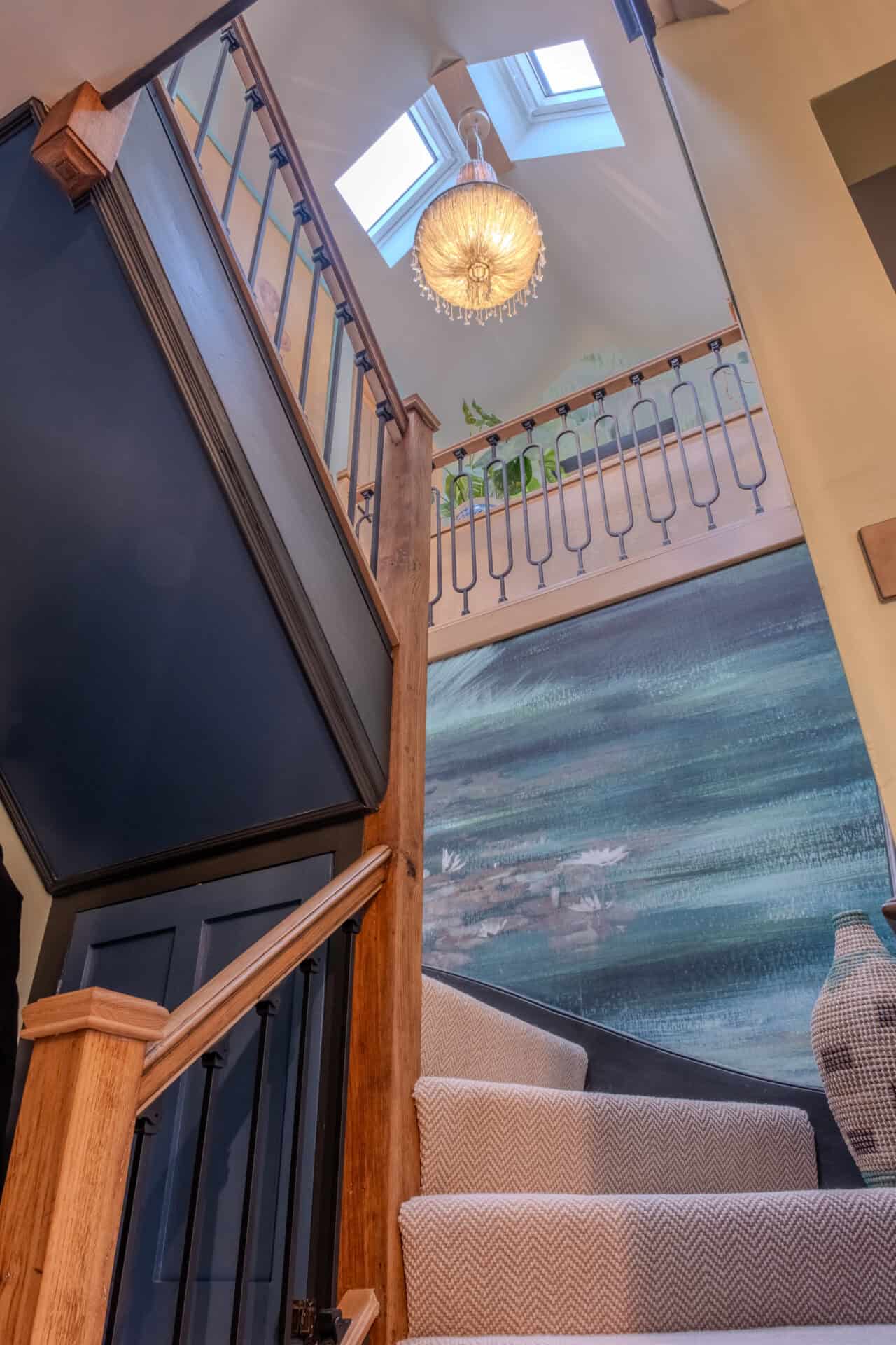
Most people choose a whole house colour scheme one room at a time, which means they never really choose one at all. A client showed me her phone last spring: twelve paint chips, one per room, each picked on a different weekend. Every colour was lovely. However, standing in her hallway, looking through three open doors at once, the house felt like it had been decorated by three different people.
That gap between how colour is chosen and how it’s lived with is behind a lot of repainting. A 2025 Opinium survey of 2,000 UK adults for Direct Line found that disliking the colour was the top reason people regretted home improvement work, and put the average cost of changing your mind on décor at £3,819. Most of those regrets start in the same place: colour chosen in the wrong context, one room at a time, from a small card under shop lighting.
You never see a room on its own
Paint charts encourage you to think in boxes, but your house doesn’t work that way. You see the kitchen from the hall, the sitting room through the dining room, the landing every time you go up to bed. In a Victorian terrace the view runs straight from the front door to the garden. In an open-plan extension, three or four zones share one sightline, which is why the open plan vs broken plan question shapes colour as much as layout.
So the useful question is what each room looks like next to the room beside it. That’s where a whole-home palette earns its keep. Each room can still have its own mood, and the house reads as one place you move through.
Paint charts encourage you to think in boxes. Your house doesn’t work that way.

Start with how you want each room to feel
Before a single sample pot, I ask clients how they want to feel in each part of the house, and, crucially, at what time of the day or evening. A kitchen that wakes you up at 7am needs a different energy from a snug you sink into at 9pm. A hallway is a threshold: the first thing you see coming home and the last thing guests see as they leave, so it needs to bridge both ends of the day.
Light matters as much as mood. A north-facing room gets cool, even light all day, so warm earthy colours tend to hold their depth here. A south-facing room takes on far more warmth in the afternoon. So, for example, the same green can read fresh in one and murky in the other.
Write those feelings down, room by room, with the direction each one faces. That list becomes your brief. It’s also why a Pinterest board or a paint brochure can only take you so far: those rooms were designed around someone else’s light and someone else’s life.
How to build a whole house colour scheme
Pick one source. The calmest schemes I’ve designed all came from a single place: a stretch of Suffolk coastline, an autumn hedgerow, a rug a client had loved for twenty years. Nature is especially good at this, and it sits at the heart of biophilic design, which is far bolder than its reputation. Think ochre lichen on stone, deep teal water under an oak tree, rust bracken against moss. Those combinations work together because they grew up together.
Pull five or six colours from it. That’s plenty for most houses, however many rooms there are. You want a mix of depths: a couple of grounding darks, a mid-tone or two, and a lighter colour that can carry the hall, stairs and landing.
Keep the undertones related. Colours with a warm, earthy base sit happily side by side, even when one is pale clay pink and the next is deep terracotta. However, if you put a cool, blue-based grey between them and the whole sequence jars.
Then choose a thread. One colour or material that runs through every room and ties the rest together. In one of my recent projects, every room has its own wall colour, but the architraves and skirting boards are charcoal black throughout. Walk through that house and the walls change from room to room while the dark line around every doorway stays constant, so it still feels like one house. A brass tone in the door furniture, or a green that turns up on joinery in one room and in a fabric in the next, can do the same job. That repetition or rhythm is what the eye reads as flow.
Painting every room the same colour might seem like the obvious way to connect a house, but it rarely works as well as you’d expect. Light changes from room to room, so one colour ends up looking slightly different in each space, and the house can feel flat rather than connected.
The hallway holds it together
Treat the hall, stairs and landing as the spine of your whole house colour scheme, since they touch every other room. They can be the boldest space in the house or the most restful, as long as they’re chosen with what sits either side in mind. A rich ochre hallway makes a deep green sitting room glow through the doorway. A pale hallway lets a run of strong rooms each make their own statement. Either way, the hallway is the one place you can stand and see the whole palette at once, so it’s where any weak link shows first.
Bold rooms belong in a flowing scheme
Flow is often mistaken for sameness: one safe colour everywhere so nothing can clash. The result is a house with no peaks, and no room that makes you stop in the doorway. A connected palette is what allows you to be braver. A black-green study, a terracotta kitchen, a clay pink bedroom: each one can be strong because it shares an undertone and a thread with its neighbours. I’ve written before about why playing it safe can be the most expensive decision in a renovation, and colour is where you feel that most.
A connected palette is what allows you to be braver.

Test it in sequence
Paint large samples on lining paper, at least A3, and move them around the house. Look at them up close, then from the doorway of the next room, which is how you’ll see them most of the time. Check them in the morning, at dusk and under your own lamps, as warmer or cooler bulbs shift a colour more than most people expect. Lay the samples out in the order you walk through the house. If one transition feels abrupt, adjust the depth of a single colour before giving up on the pair.
Settle the palette before anything is ordered
In a renovation, colour is never only paint. Flooring, kitchen cabinetry, tiles, worktops, joinery and window frames are all colour decisions, and most are ordered months before a decorator arrives. Those are the expensive ones to change.
That’s why a whole house colour scheme is part of The Cornerstone™, set alongside how you want to live in each space. By the time an architect or builder is appointed, the colours already have a logic, and every later choice has something to be checked against.
If you’d like to talk through your own home, book a free Clarity Call. I’d also love to hear which room in your house already feels exactly right, and which one feels like it belongs to somebody else’s home.
I design whole-home colour schemes for period and new homes across Essex, London and Suffolk.
Common Questions
How many colours should be in a whole house colour scheme?
Five or six works for most homes, whatever their size. Include a couple of deep colours, one or two mid-tones and a lighter shade for circulation spaces. Extra colour can come in through fabrics, art and furniture, leaving the walls to hold the structure.
Should every room in a house be painted the same colour?
One colour throughout tends to make a home feel flat, and rooms facing different directions will make the same paint look inconsistent. Related undertones and one repeated colour give you connection while each room keeps its own character.
What colour should a hallway be?
Choose it alongside the rooms that open off it, since a hallway is seen next to almost every other space. A strong hallway colour works well when the rooms around it are lighter. A calmer one gives a run of bold rooms room to breathe.
Should woodwork be the same colour throughout the house?
It’s one of the simplest ways to connect rooms with different wall colours. A single woodwork colour throughout, or one per floor, gives the eye a steady line to follow. Dark woodwork such as charcoal or near-black frames each wall colour sharply, and in period homes it often looks far richer than brilliant white.